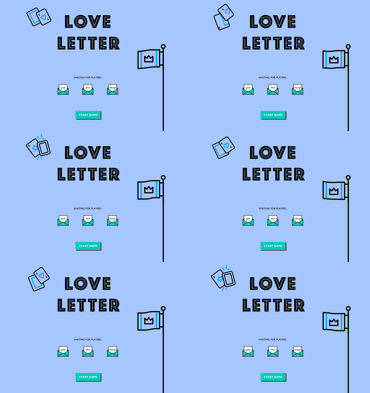
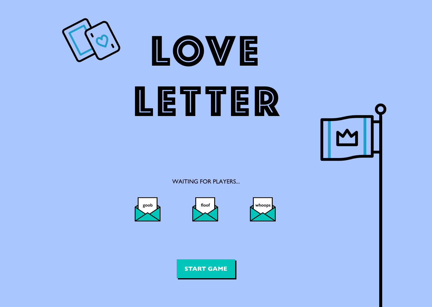
Love Letter
"The good Princess Annette, heartbroken over the recent arrest of her mother Queen Marianna for high treason, has locked herself in the palace. You are a suitor trying to ease her pain by sending her letters of love. Since you cannot reach her immediately, you must rely on intermediaries to carry your message."
A friend and I were bored during the pandemic. So we implemented our favorite board game, Love Letter, onto a locally-hosted web platform to play with the rest of our friends over Zoom. The interface design included the layout and positioning of 18 cards and 3 screens which incorporated all gameplay controls (points, tokens) to support interactive online play for up to 8 players.
Role: UI/UX design, game design, front-end development, wireframing, prototyping, playtesting
Tools: Figma for wireframing and design, ReactJS for development
Date: June 2020
Code: GitHub
Design Goals
Our aim was to make a simple, intuitive web application that would bring back the experience of playing a cozy board game with our loved ones. Love Letter is a strategy card game at its core, so I focused on three main goals:
- Clean: Steer clear of any unnecessary components and keep the focus on gameplay.
- Simple: Keep the design intuitive so that someone with little to no experience with technology would be able to play.
- Community: Match the original gameplay to retain the vibe of the game and maintain a sense of community.
The Approach
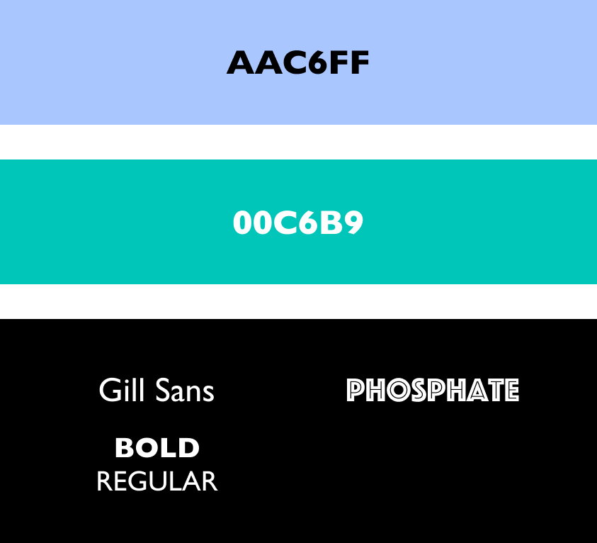
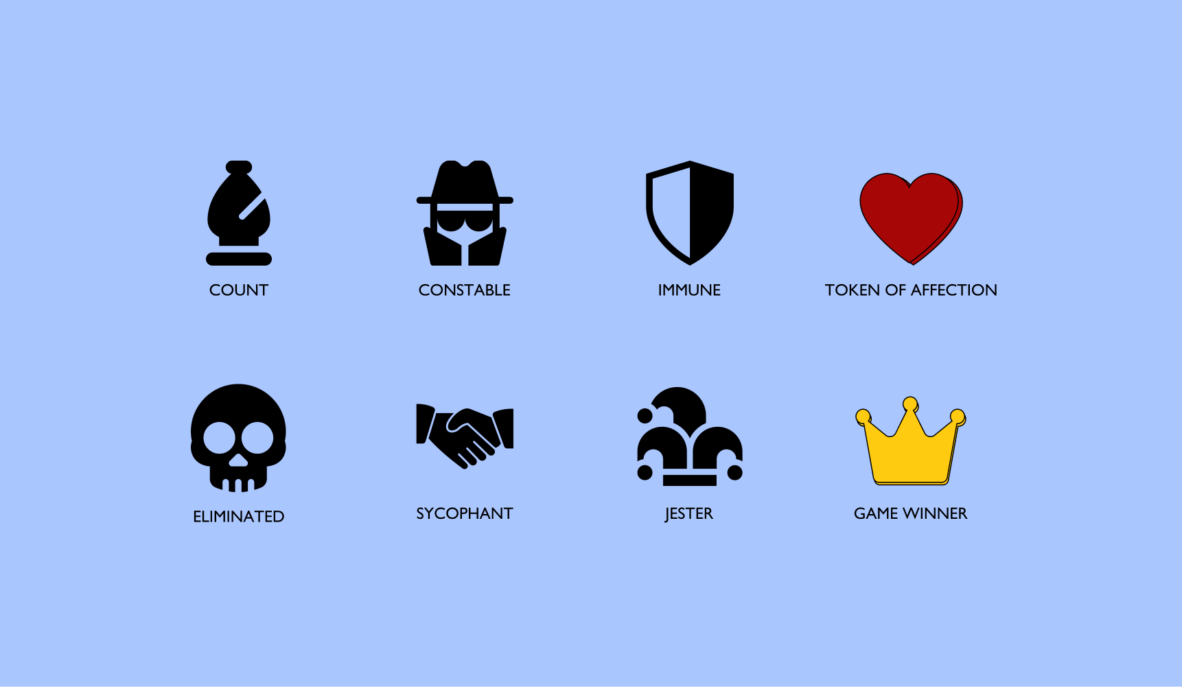
Since this is an online game, I went for a contemporary and friendly aesthetic. I went for a gentle color palette, easy-to-read typography, and intuitive iconography (to indicate any status changes).
User Workflow
.jpg)
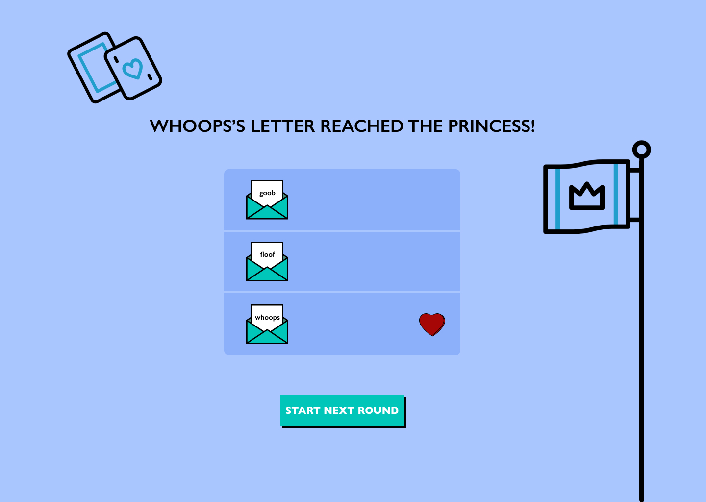
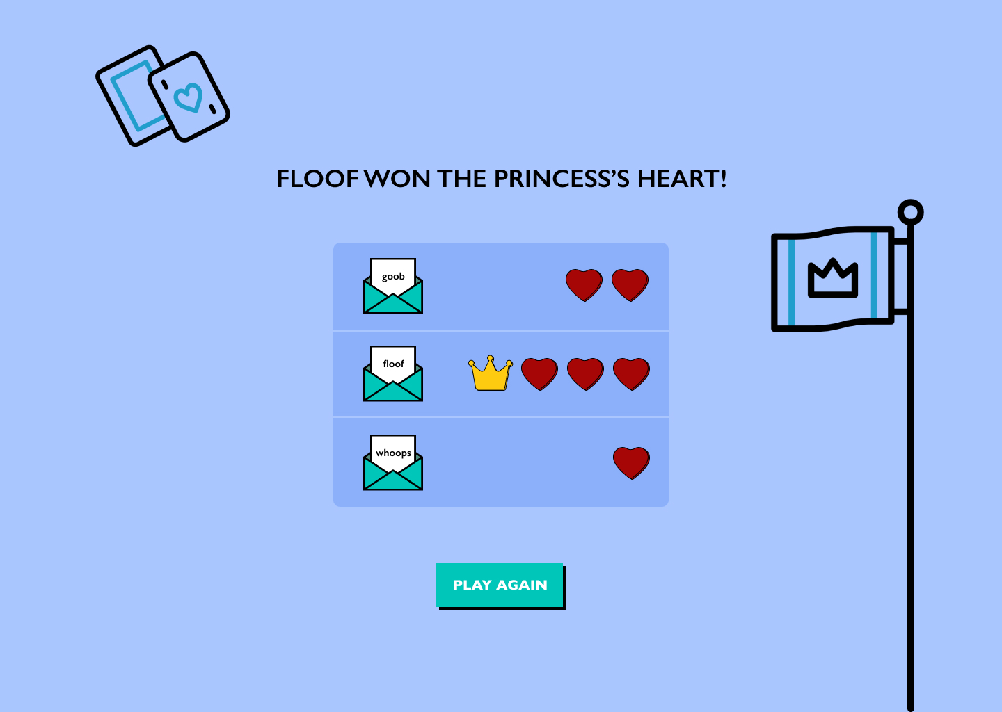
At any point in time, a player could either be playing, spectating, or eliminated (in which case they'd still be spectating but outside the game circle).
.jpg)
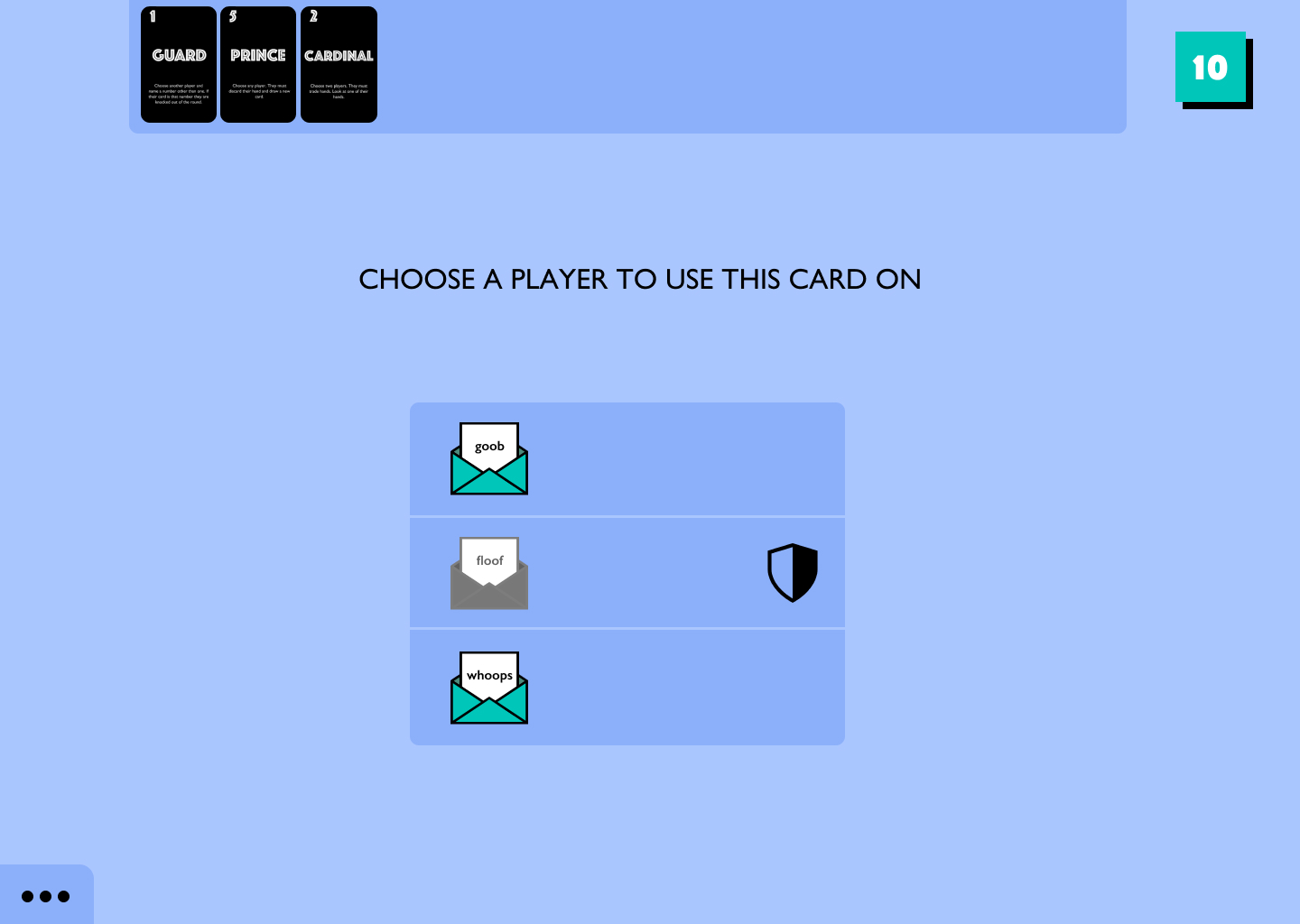
Some cards give players additional properties. For example, on playing the 'Handmaid' card, a player receives immunity until their next turn. This was indicated by a simple shield.
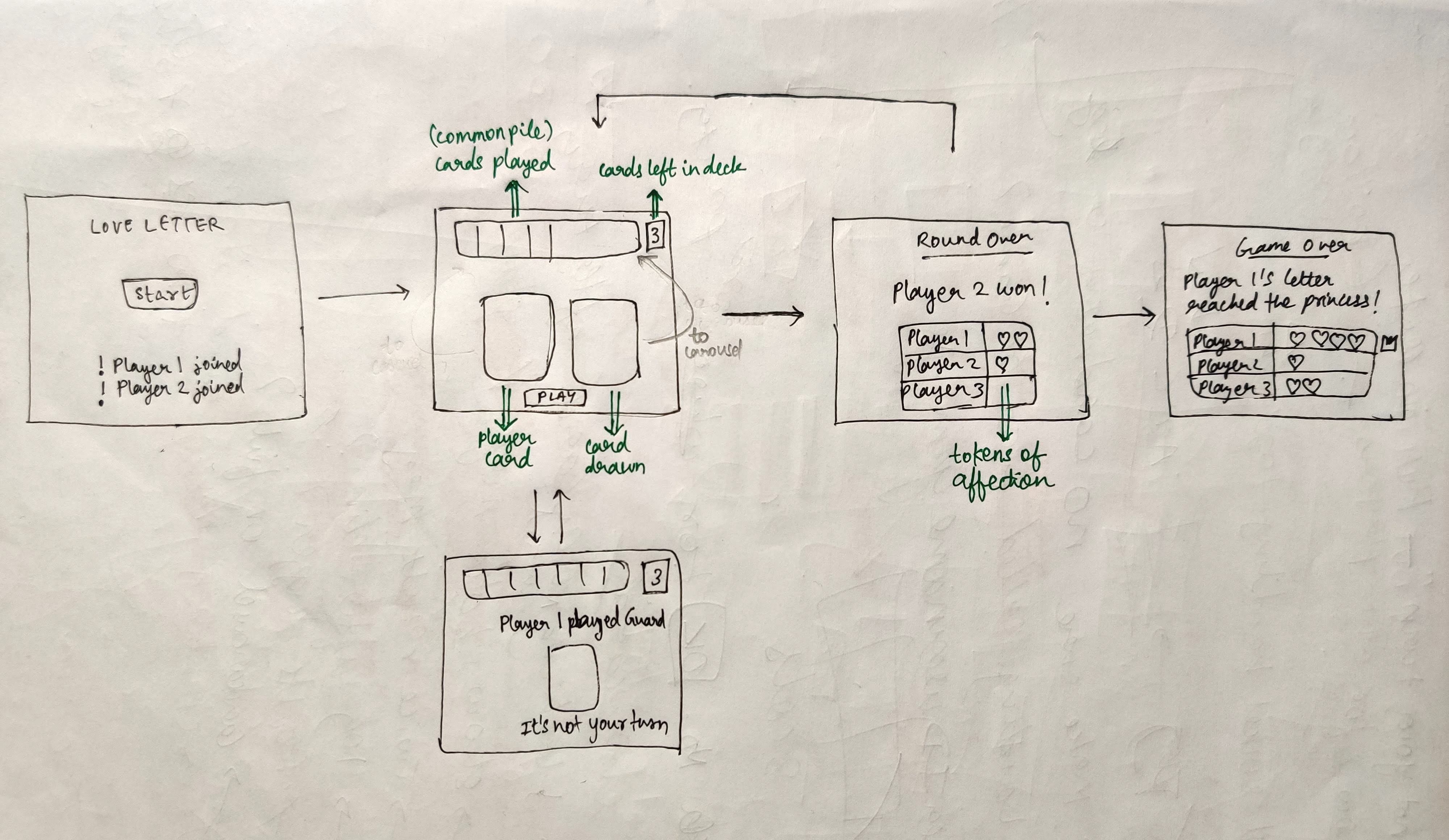
Initial Wireframing
Outcome Highlights
A common starting point
DESIGN GOAL
Community
USER SCENARIO
With the game being virtual and server-hosted, there can be a disconnect between players which may lead to them not knowing what's going on.
SOLUTION
Ensured that all player screens were in sync with each other. Each player could see what was going on as if they were sitting in a circle.
Simple and easy-to-grasp iconography
DESIGN GOAL
Clean, Simple
USER SCENARIO
Users who do not often participate in the gaming community find it hard to understand what symbols mean.
SOLUTION
Introduced simple icons that you would come across daily.
Further Improvements
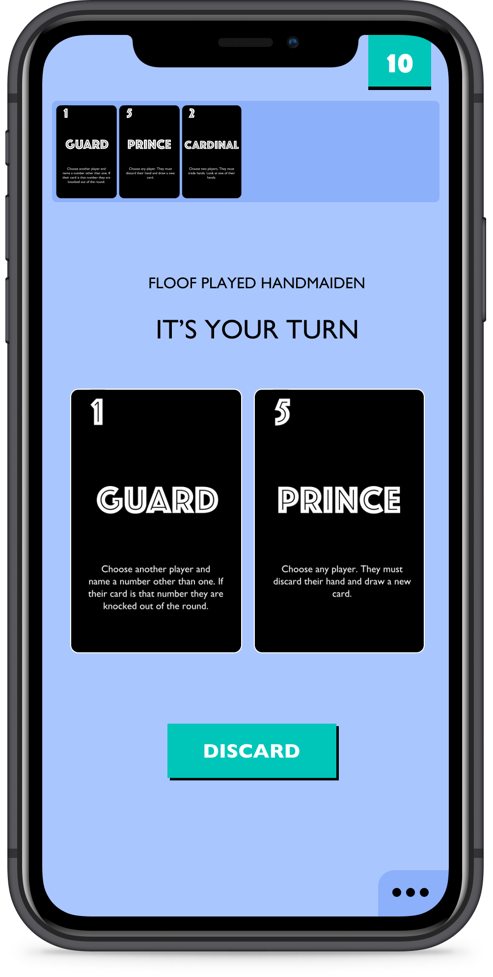
- One pain point we missed was a screen for when users get disconnected from the game.
- The cards in the used pile could be more simplified. Currently, it's difficult to see the card numbers clearly on mobile.
